
Inter Milan's brand update is a winner
The Italian football club looks to the past when reworking its visual identity for the 21st century
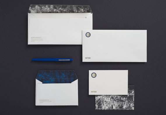
Attenzione, football fans. Inter Milan’s 106-year-old crest and its myriad of sub-brands have been streamlined. The work was carried out by the Milanese graphic design studio Leftloft, which had the enviable task of delving into the football club’s archives for inspiration. Now, black-and-white photos of key moments in Inter’s history appear on the reverse of the new business cards and compliment slips, and on the inside of envelopes.
The new logo does away with the old star that once sat above the crest. The number of coloured rings around the marque has also been reduced, and the insignia has been slightly simplified.
Leftloft’s art director Francesco Cavalli describes the new look as “a strong, modern personality with a careful review of iconic and traditional elements.” He should know; his other clients include Pirelli and Moleskine.
Meanwhile, the previous sub-brands were a mishmash of sizes with all manner of suffixes and prefixes in different styles and colours. Now, all that has been formalised with ‘Inter’ in capitals and the sub-brand beneath it in lower case, all of which sits to the right of the crest.
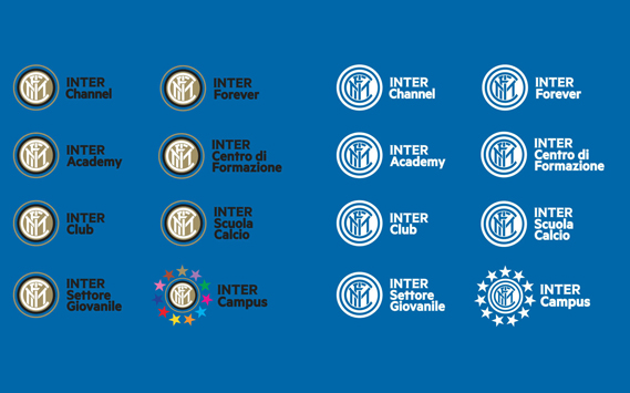
While the new logo is not a million miles away from the old one, Leftloft’s main focus has been introducing a new typeface and – most importantly of all – producing new design guidelines for suppliers and licensing partners. These, says Cavalli, should “unify the branches that, over the years, have developed inside the company”.
Cris Sowersby, who runs Klim Type Foundry in Wellington, New Zealand, was tasked with designing a new typeface, called Inter Metric. Cavalli says that “as a result of the club's strong relationship with its past, we thought the sans serif fonts, which are typical in the identities of sports teams, were not suitable.” The chosen character set, with their slightly flared ends, certainly looks like a winner to us. For greater insight into centuries of graphic design, buy a copy of The Phaidon Archive of Graphic Design.